Oly Su / Visual language / 01
Design meets engineering.
The source of truth for portfolio component patterns. These live examples use the same implementations as the homepage. Change a shared component here, then verify it on the production page.
01 / foundations
Quiet canvas. Clear signal.
Dark blue-violet surfaces, warm white type, and a precise lime accent. These swatches read directly from the site’s semantic colour tokens.
Canvas
--backgroundThe quiet foundation.
Surface
--cardA subtle step above the canvas.
Ink
--foregroundHeadings and primary reading.
Secondary ink
--muted-foregroundSupporting copy and metadata.
Signal
--primaryA deliberate point of emphasis.
Rule
--borderStructure without visual noise.
Space
An 8px rhythm, generous section breaks, and fluid page gutters.
Structure
A 1200px container, thin rules, and small radii keep the work in focus.
Emphasis
Use lime for meaningful links and a few words, with restrained decoration.
02 / typography
Type does the work.
Space Grotesk gives headlines their character. Geist keeps longer passages readable. JetBrains Mono adds a small technical accent.
Display / Space Grotesk
Thoughtful by design.
Built to work.
An idea, made tangible.
The strongest product experiences connect what people need with what technology makes possible. Clear language and comfortable line lengths leave room for the story.
Metadata / JetBrains Mono
Product design / Developer experience
Keep metadata short. Use sentence case for reading and reserve uppercase for compact labels.
03 / introduction
Centred neural hero.
Full-width atmosphere, centred copy, and one clear pair of actions. The shared hero uses gradient shading and a perspective neural network with soft edge fades. It responds to pointer movement, pauses offscreen, and stays static with reduced motion.
The live hero below spans the page width. No project imagery or repeated content appears in the hero. Its heading is level three in this reference and level one on the homepage.
Canva / AI × Apps SDK × API
I’m a product designer & design engineer
With my background in software engineering, I help developers and AI agents build intuitive experiences that feel native—through API-informed interaction patterns, clear design guidance, and working prototypes.
Currently at Canva. Previously at Buildkite and Qantas
04 / projects
Selected work.
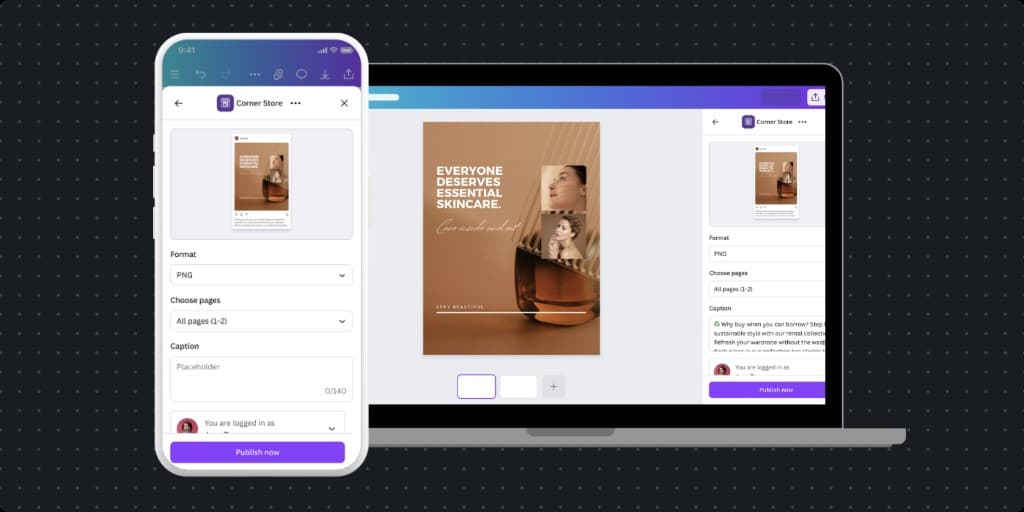
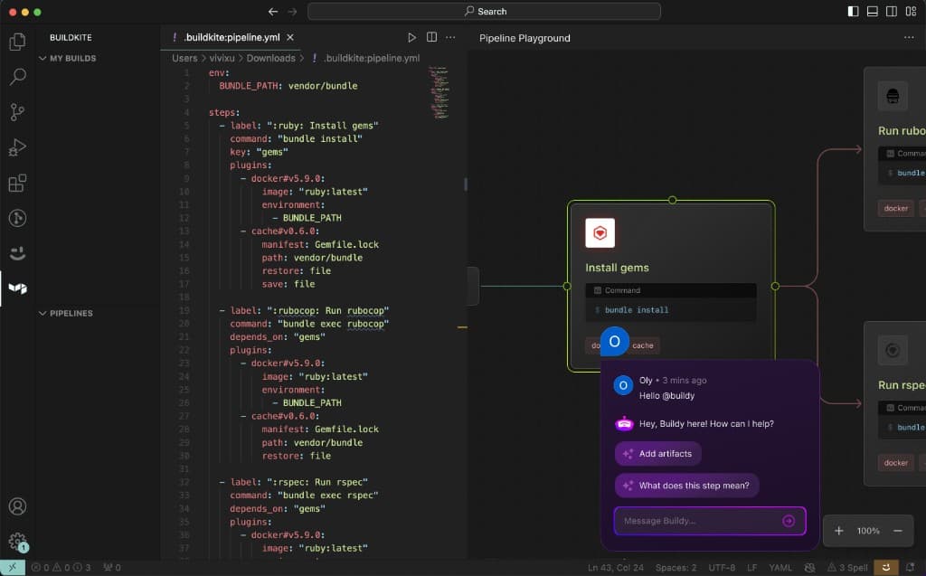
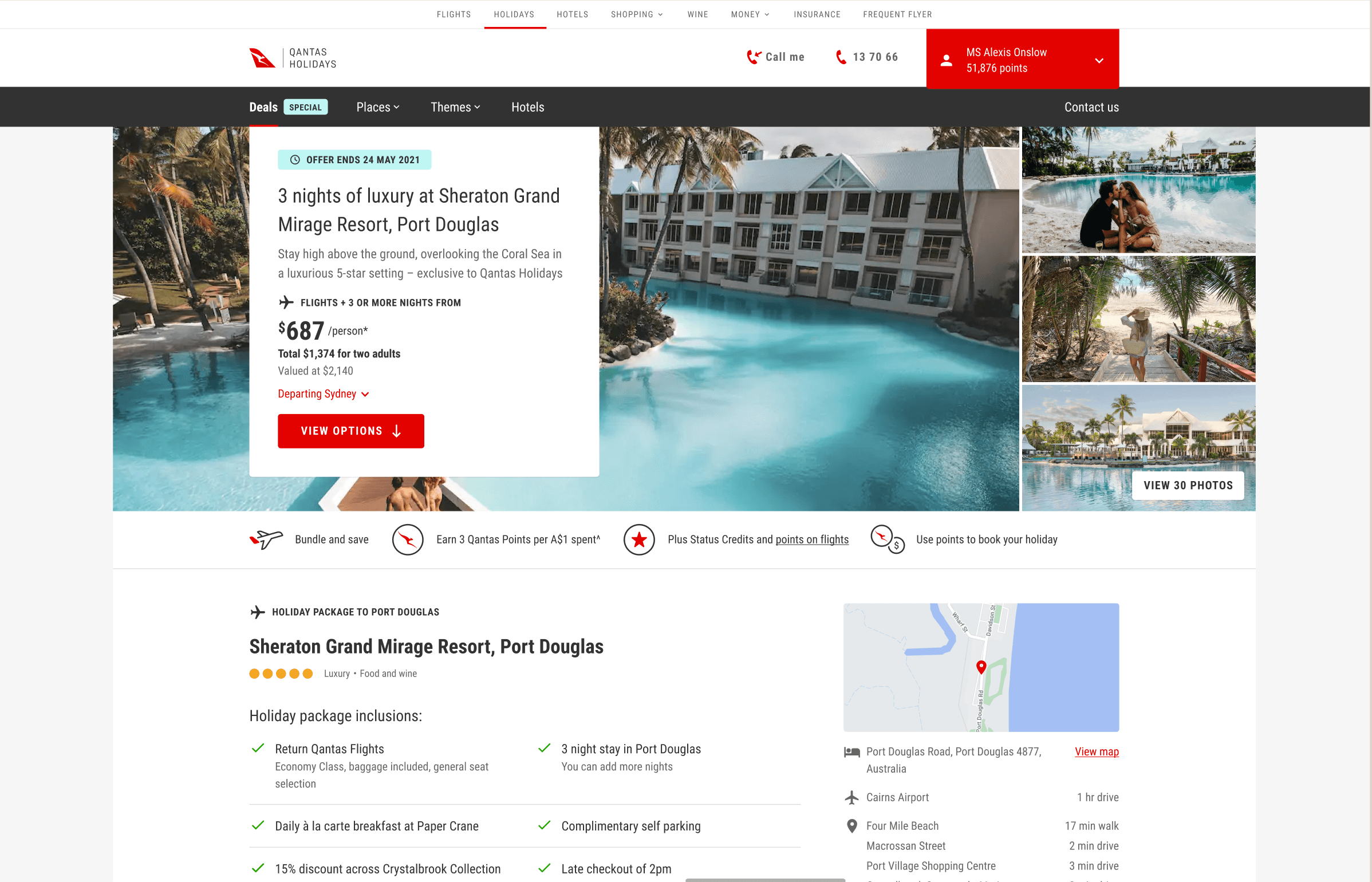
Use a single section title without an eyebrow or project count. Feature the first project and pair the rest. This is the same section used on the homepage, driven by projects.json.
Selected work
05 / experience
Breadth of experience.
Keep all ten logos near the bottom of the page. Relationship-neutral copy covers product teams, client projects, and platform integrations. Current and previous employers are identified in the shared hero.
Across teams and platforms
Companies I’ve worked with
Across product teams, client projects, and platform integrations.









06 / interaction
Small gestures. Clear intent.
Use a solid button for the primary action and an outlined button for the secondary action. Both omit arrows. Contact actions such as “Let’s talk” use the outlined button. Links and project cards omit decorative arrows. Keyboard focus stays visible.
Try the components
Tab through links to see focus states. Hover over a project to see its image treatment. With reduced motion enabled, image transitions are removed.
Design × Engineering